Vicente Hernaiz
UXDG 315 · Project 2 · Interface moodboard
Scan to follow along on your phone →
Pinterest · Brand & UI redesign
Loud ideas,
calm grid.
One design direction for a warmer, more social Pinterest.





Vicente Hernaiz · UXDG 315 · Project 2
01
Context
What are we fixing?
Context · The app
Without the red, who is it?
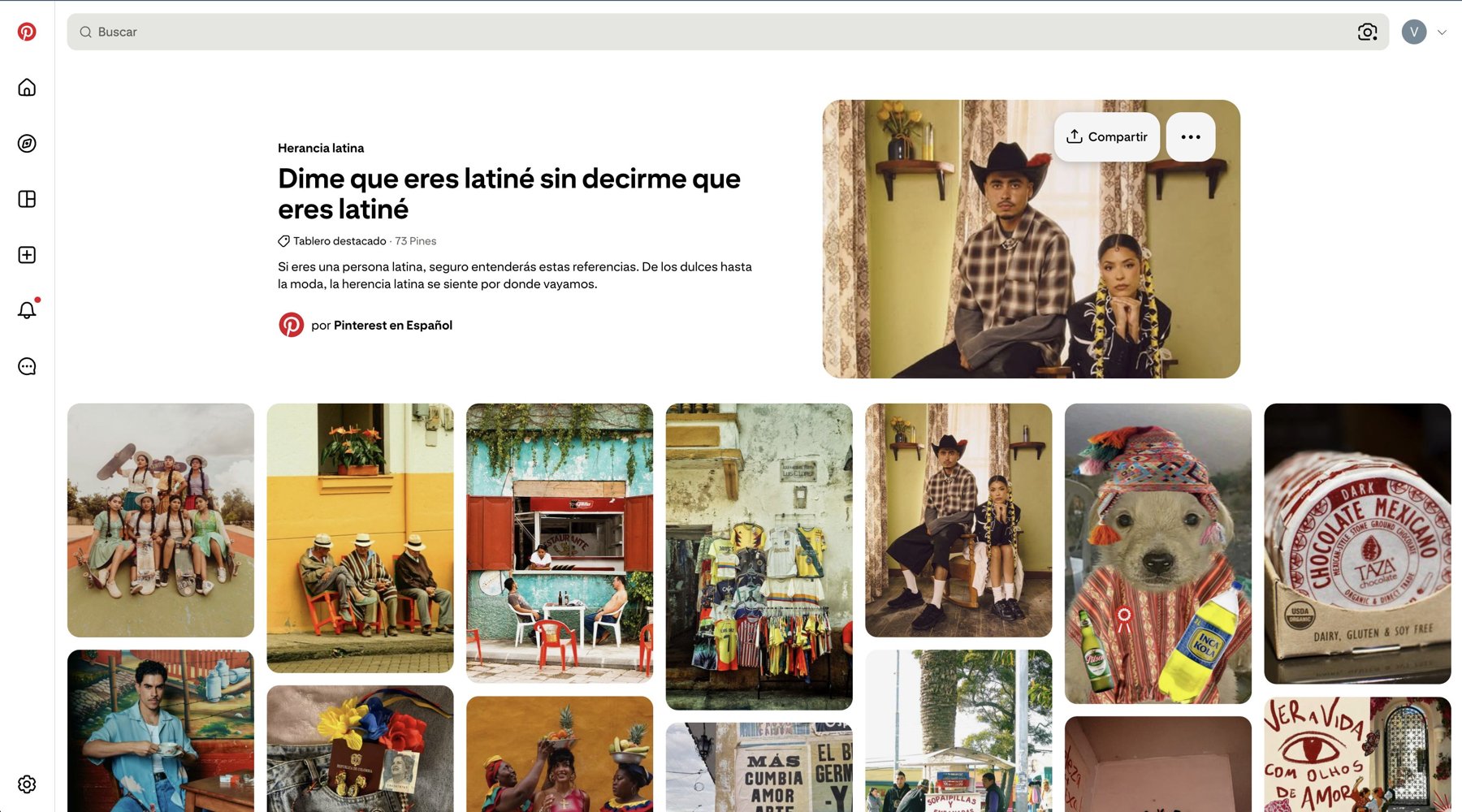
Black, white and generic greys. Take the logo away and the app could be anyone’s.
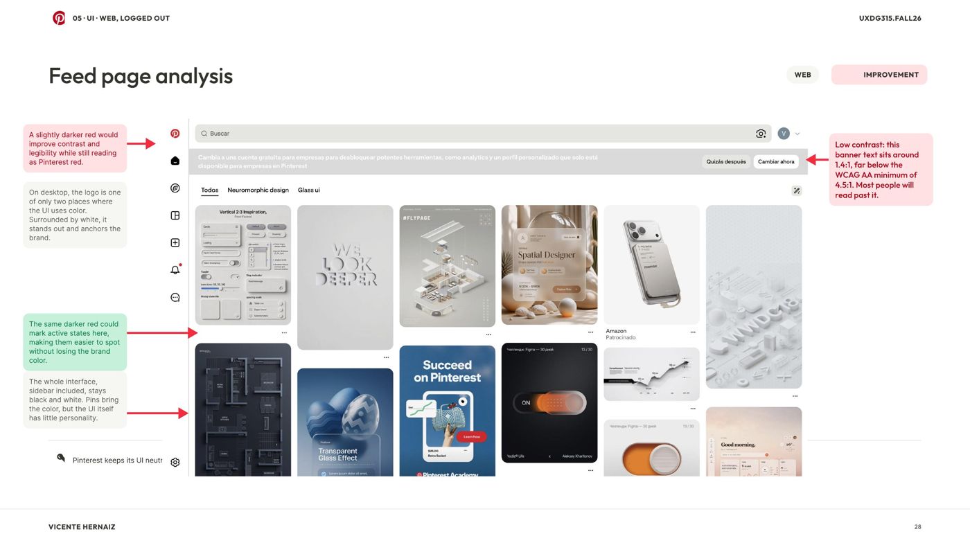 Only the red is brand
Context · Communication vs product
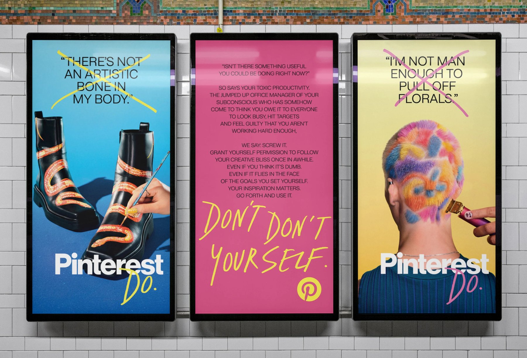
The ads have a voice. The app doesn’t.
Context · Interaction
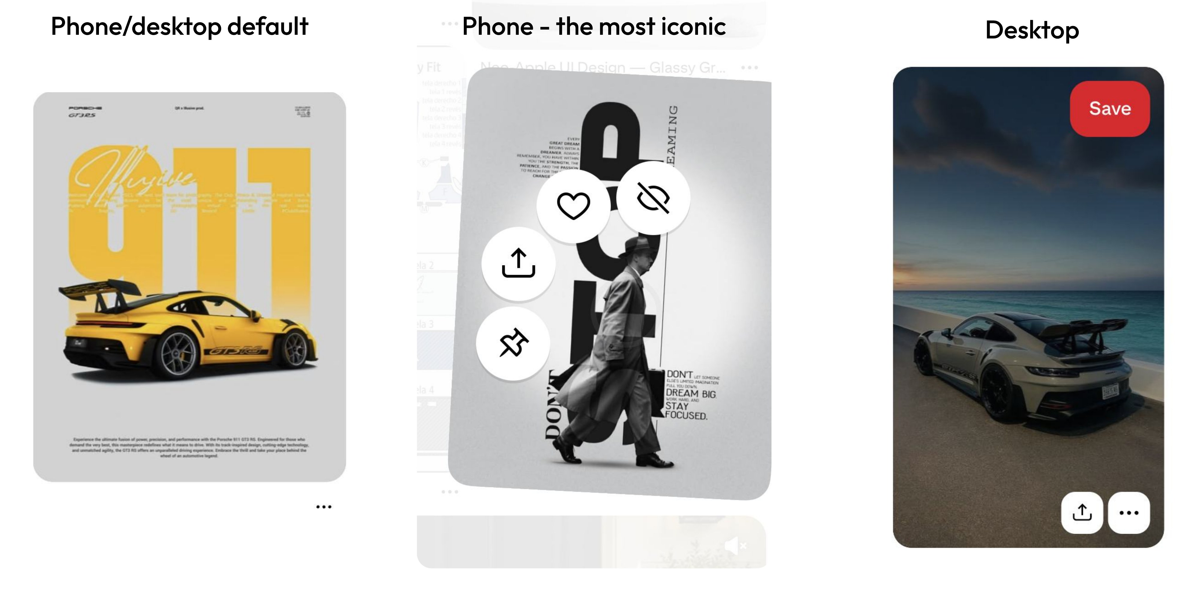
A fan on the phone. Two buttons on desktop.
The press-and-hold fan is the only gesture that feels like Pinterest. Desktop gets a generic hover.
Context · Small fixes
The bugs are small.
Worth fixing, but they are not the problem. The problem is personality.
Alignment
Edges drift between web and app
Spacing
No shared rhythm
Type
One typeface, drifting sizes
Navbar
Functional, no character
02
What did we learn?
Four things Pinterest already owns.
Insight 01
The grid is the brand.
People recognize Pinterest by its masonry, even without the logo.
Insight 02
The circle is the second shape.
The logo, the avatars, the save button. Circles already sit on top of the grid.

Insight 03
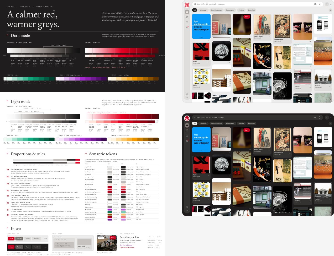
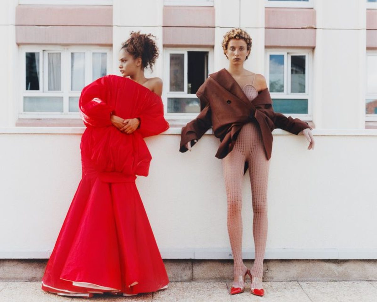
Red, white, and warm greys.
Today the red sits on cold, generic greys. Warmer neutrals make it feel like home.
Insight 04
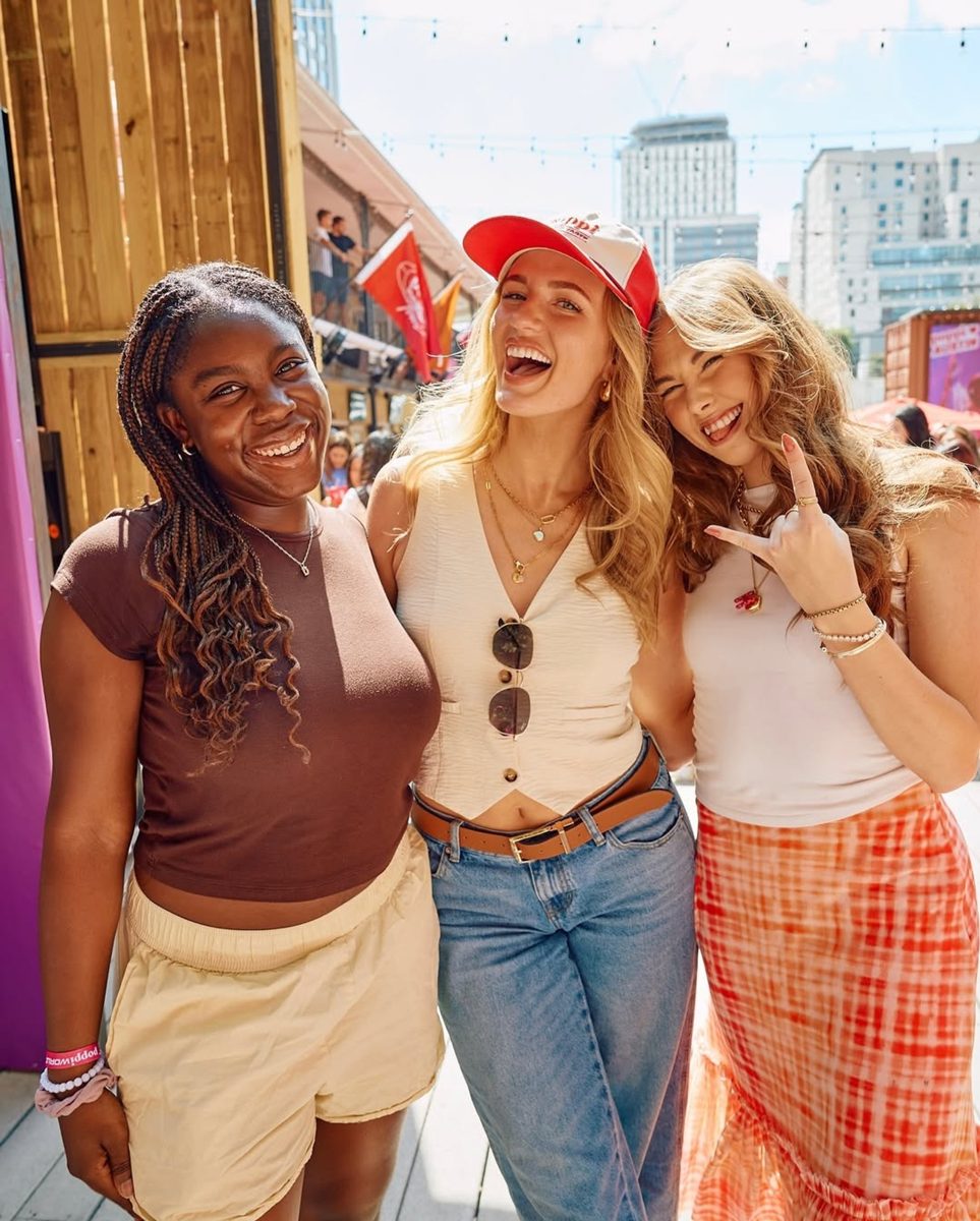
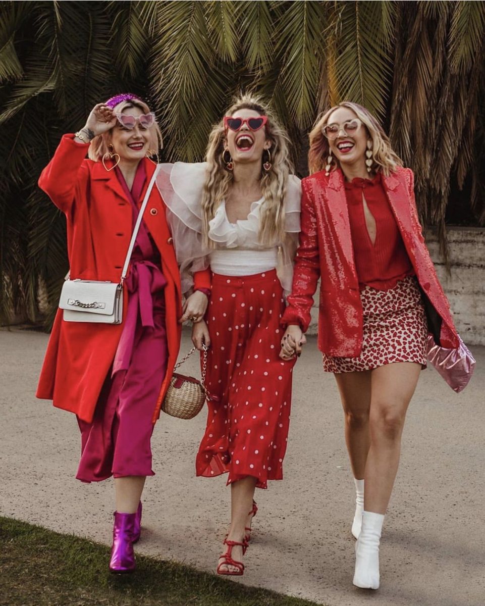
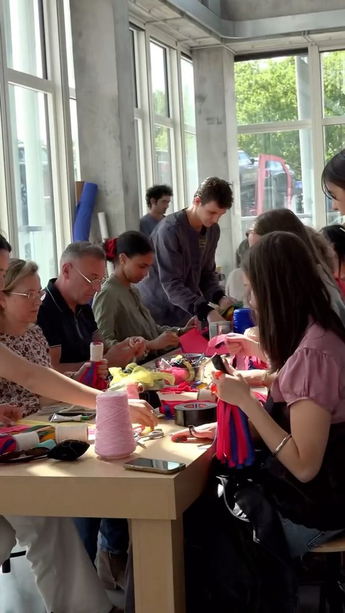
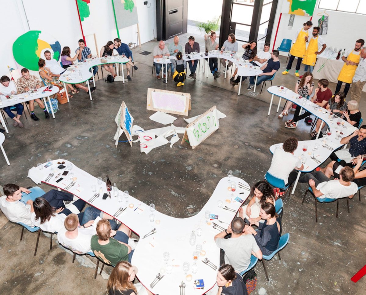
Pinterest is made by people.
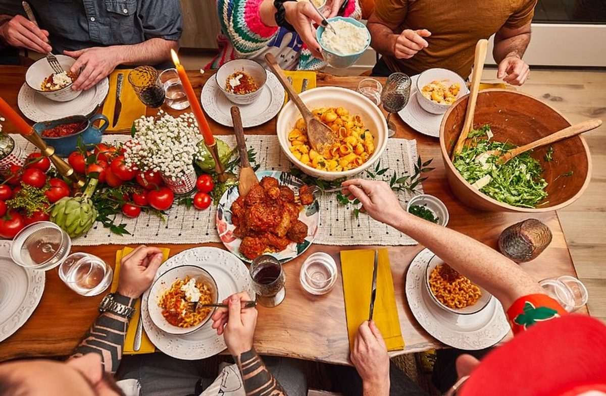
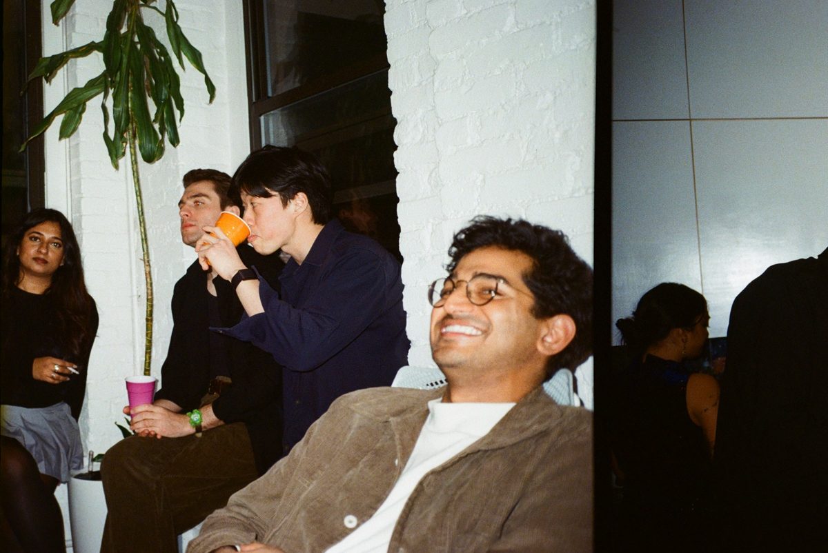
Every pin is someone’s real table, room or outfit. The brand should look like its community, not like stock.


What we learned
One brand, two temperatures.
Calm grid
The app. Where you decide, save and plan. Quiet, warm, images first.
Loud ideas
The public web and campaigns. Where you get inspired. Playful, tactile, bold.
03
The idea
What are we proposing?
The idea · Our name
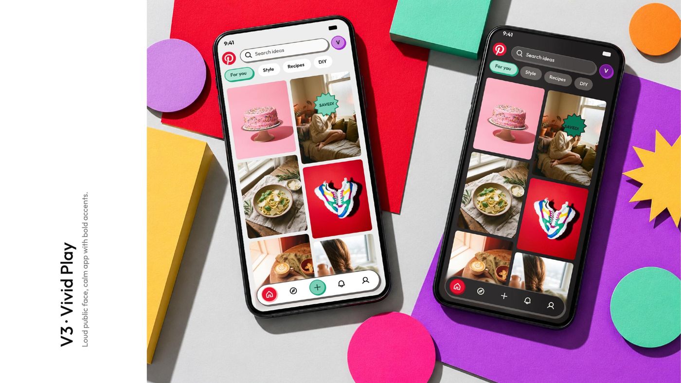
Loud ideas,
calm grid.
with a brand layer called Tonal Play
The statement, explained
One color,
many voices.
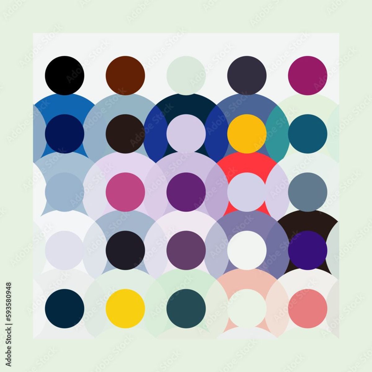
Red is the one brand color, held by warm neutrals. Every other color belongs to the community: the people, their photos and what they save.
One color
The brand
Many colors
People and actions
The idea · Calm grid
The app stays calm.
Quiet and warm, so your photos lead. The playful touches only show up in small moments, like a star on a pin your friends loved.
The idea · Motion
Motion that bubbles, never shouts.
Press, the actions bubble out toward the pin, release. Soft springs and blur fades. Never a hard cut.
The idea · Bubbles
Every shape has one job.
SaveKeep it
Pin
Save to your board. The main action, the only one in red.
♥ 248Love it
Heart
A quick reaction for the creator.
Maya, Leo +4 loved thisFriends loved it
Violet · your circle
See what the people you follow loved.
You + 3 friends made thisMade it together
Green star
You and your friends tried it and shared the result.
Saved with 3 friendsSaved together
Yellow star
One shared board the whole group plans on.
Loud ideas · Ads & comms
Out in the world, it gets loud.
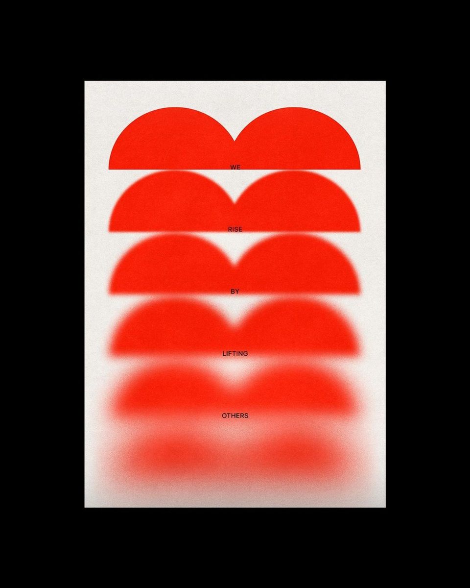
Thick borders, hard shadows, stickers and one red. Built to stop the scroll and pull people in.
Made it
together.
04
Evidence
How does the design support the idea?
Evidence · Who it’s for
Two people, one Pinterest.
Calm grid
Women 18–34
Everyday planners and savers. The two largest groups on Pinterest.
Loud ideas
Gen Z 16–24
Arrive from TikTok and Instagram. Over half of Pinterest’s users.
Sources: DataReportal 2025 · Pinterest Q2 2025 results · Pinterest Business audience.
Evidence · Calm grid
Calm keeps you in.
A quiet, warm interface lets photos lead. Nothing pushes you out, so planning stays relaxed and sessions stay longer.
Evidence · Loud ideas
Loud pulls you in.
Brutalist stickers and hard shadows catch the eye in ads and social, then point to one action: open, save, make it.
05
Impact
Why does it matter?
Impact · Why it matters
Next to TikTok and Instagram, quiet is invisible.
Pinterest needs a brand you can recognize without the logo, in the app and outside it.
Impact · What changes
A brand, not just a red.
Recognition
A style people spot before they see the logo.
Retention
A calm app people stay in to plan.
Community
Every accent is a person, so users feel seen.